
Video Game UI/UX Design: A Practical Guide
5 January, 2026
Learn the do’s and don’ts of video game UI/UX design, with real examples, common mistakes, and best practices for aspiring game designers.
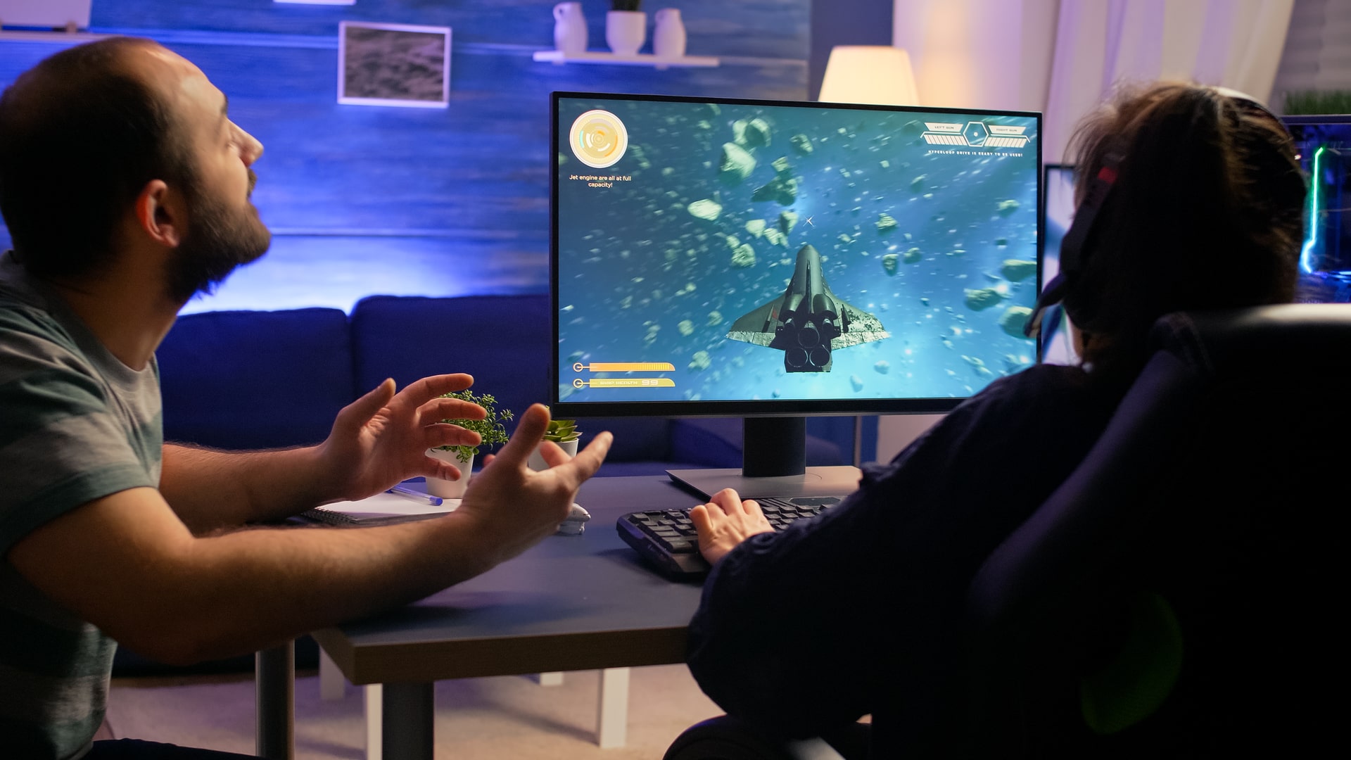
UI and UX design in games often operate in the background, players rarely comment on good UI, but they immediately notice when something feels confusing, slow, or visually overwhelming.
That’s the paradox: the better the UI, the less players think about it. Whether it’s the seamless weapon wheel in The Last of Us, the emotionally responsive HUD in Dead Space, or the clean quest navigation in Genshin Impact, UI/UX quietly shapes the entire experience.
Beginners often assume UI is just “menus and icons,” but professionals see it very differently.
UI/UX is about anticipating player intentions, managing cognitive load, and guiding players without interrupting immersion.
This is one of the most misunderstood areas of game design, yet one of the most influential.
Before we dive into do’s and don’ts, it is important to understand how UI/UX fits within The Art of Game Design, because UI doesn’t stand alone it’s the bridge between what the designer intends and what the player understands.
To learn how great games are structured from the ground up,
Explore our pillar guide — The Art of Game Design
Why UI/UX Matters More Than Most Beginners Realise
A great illustration of UI/UX conflict comes from Fallout 3’s Pip-Boy. Players love the concept-it’s immersive, diegetic, and fits the world perfectly—but usability takes a noticeable hit.
The map, for instance, appears within a small section of the Pip-Boy’s screen, even though the full screen around it is available.
Most games enlarge the map to fill the entire display so players can read it quickly. In Fallout 3, you’re looking at a “screen within a screen,” which means valuable space goes unused while players struggle to view basic navigation information.
The problem isn’t the aesthetic. It’s the balance between immersion and readability. The Pip-Boy interface looks great, but by restricting the functional area, it slows down something as simple as checking the map.
A small adjustment-either zooming the map or letting the interface temporarily fill the whole screen—would have improved usability without sacrificing the theme.
This example highlights a UI/UX truth:
When visuals get more attention than function, usability suffers—no matter how iconic the design is.
If you’re unsure where UI/UX fits in the broader creation process, read our cluster guide
Game Design vs Game Development: What’s the Difference?
UI vs UX: The Simple Breakdown Most Beginners Need
What does UI (User Interface) mean?
The visual elements the player interacts with: menus, buttons, HUD, icons, inventory layouts, crafting screens.
What does UX (User Experience) mean?
The underlying logic: how information is organised, how quickly players understand actions, how easy it is to learn.
One of the clearest examples is Fortnite. Its UI looks colourful and youthful, but UX decisions—like quick weapon swapping or the clear inventory grid—are designed for speed under pressure.
UI/UX Do’s: What Strong Game Interfaces Consistently Nail
1. Keep Information Easy to Find
Every click adds friction. Riot Games revealed that reducing menu layers in Valorant’s early UX tests increased retention in new players by nearly 20% (source: Riot Dev Diaries, 2022). Good UI communicates in seconds, not minutes.
2. Build Visual Hierarchy
Players’ eyes should land first on what matters most: health, objective, ammo, cooldowns.
This is why Halo Infinite keeps its HUD minimal but bold—everything essential is readable during high-speed combat.
3. Follow Player Expectations
Players are trained by decades of game conventions. Respecting those patterns improves UX dramatically.
Expectations like:
- “Back” on top-left
- “Confirm” highlighted
- Scroll direction consistent everywhere
Breaking these conventions frustrates players, unless done intentionally for narrative reasons.
4. Match UI With the Game’s Identity
UI is part of worldbuilding.
Persona 5 is a textbook example—its UI is loud, graphic, and rebellious because the game’s theme is rebellion.
5. Teach Through Interaction, Not Text
The best games teach players without demanding long tutorials.
Nintendo excels at this—Breath of the Wild communicates mechanics through animation cues, sound, and visual signals.
If you want frameworks to evaluate your UI/UX decisions, explore our guide on
Top 10 Game Design Lenses You Should Apply to Your Game.
UI/UX Don’ts: Mistakes That Break Player Flow
1. Cluttered Screens
Too much information increases cognitive load and slows reaction time. Ubisoft acknowledged that early versions of Assassin’s Creed Odyssey faced UI criticism for being too cluttered—players felt overwhelmed, not empowered.
2. Essential Actions Hidden Too Deep
If a player has to click four times to equip something they use constantly, UX has failed. Common actions should be one or two steps away, max.
3. UI Competing With the Game World
Bright or oversized HUD elements can break immersion.
Horror games like Dead Space avoid this issue by integrating UI diegetically into the suit.
4. Ignoring Accessibility
Roughly 15% of gamers have some form of visual limitation, and accessibility options have become a standard expectation (source: Game Accessibility Guidelines, 2023). Text scaling, colour-blind modes, contrast adjustments, and remapping matter.
5. Forgetting Input Context
What works perfectly on mouse/keyboard may feel cumbersome on a controller. UX should adapt across devices.
How Studios Test UI/UX (The Real Workflow)
Game studios rarely trust intuition alone. They test UI/UX through:
- paper prototypes to check early flow
- clickable wireframes
- player observation sessions
- heatmaps and telemetry to analyse where players get stuck
- A/B testing of two UI variations
Epic Games published UX findings during Fortnite’s updates, noting that reducing friction in menu navigation significantly improves early onboarding (source: Epic UX Research, 2021).
To explore the tools used throughout this pipeline, read our guide:
Best Tools for Game Designers: From Paper Prototyping to Unreal Engine.
Why UI/UX Designers Benefit From Game Design Foundations
UI/UX is not a standalone craft. It depends on pacing, difficulty curves, progression systems, player psychology, and feedback loops.
This is why designers who study The Art of Game Design produce stronger, more intuitive interfaces-they understand why the elements exist, not just how they look.
For example
A poorly designed crafting menu often reveals a deeper issue-the crafting system itself wasn’t thought through.
Good UI exposes design clarity; bad UI often exposes design confusion.
Conclusion
UI/UX design is where clarity meets creativity. It’s the invisible hand that guides players, the structure that keeps them immersed, and the design language that supports every mechanic.
When done right, players never feel lost. They feel understood.
If you want to build games that respect the player’s time and attention, strong UI/UX skills are essential—not optional.
If you want to develop practical UI/UX and game design skills under real industry guidance, MAGES Institute offers programs built around production workflows, prototyping fundamentals, and player-centric design.
You learn how studios make decisions-not just how to use tools-and how to bring clarity to every game you create.
FAQs
1. What exactly does a UI/UX designer do in a game studio?
A UI/UX designer shapes how players interact with the game. They design menus, HUD elements, inventory layouts, and navigation flows, but more importantly, they ensure these interactions feel intuitive. Their job is to understand how players think, anticipate friction, and create clear pathways through the game.
2. How is UI different from UX in video games?
UI refers to the visual elements—icons, buttons, HUD, and menus. UX focuses on the logic and flow behind those elements. For example, a beautifully designed inventory grid is UI; how quickly a player can sort or equip items is UX.
3. Why is good UI/UX so important in games?
Good UI/UX reduces confusion, maintains immersion, and supports faster decision-making. Studies show that unclear navigation can increase player drop-off by up to 45% during early gameplay, affecting retention and engagement.
4. What are some common mistakes beginners make in game UI?
Beginners often overcrowd the screen, bury essential actions behind multiple menus, rely too heavily on text, ignore accessibility, or design UI that clashes with the game’s tone. These issues make gameplay feel slower and less enjoyable.
5. Do I need to know game design to be good at UI/UX?
Yes—at least to an extent. UI/UX is deeply connected to pacing, progression, difficulty, and player psychology. Designers who understand The Art of Game Design create interfaces that support the gameplay experience rather than compete with it.
6. What tools should a beginner use to learn UI/UX for games?
Most beginners start with tools like Figma, Adobe XD, or Illustrator for wireframes and mockups. Unity and Unreal Engine are used to test UI in real gameplay scenarios. Paper prototyping is also extremely useful in the early stages.
7. How do studios test if their UI/UX is working?
Studios observe players during usability tests, run A/B comparisons, analyse telemetry (like where players click or get stuck), and iterate based on feedback. This helps teams refine the flow before the game goes live.
8. Can strong UI/UX improve player retention?
Absolutely. When information is easy to find and interactions feel natural, players stay engaged longer. Games like Hades, Fortnite, and Dead Space are prime examples of how clean UI/UX contributes to playability and long-term enjoyment.
Related Posts
SPEAK TO AN ADVISOR
Need guidance or course recommendations? Let us help!