How Overwatch 2 Makes Digital Art Work in Competitive Gameplay
19 August, 2025
Explore how the character design team at Overwatch 2 took the differences in character art design from their original 2016 game to today’s competitive matches. Learn how to make digital artwork.
Overwatch was released in May of 2016, raising the standard (and creating a genre) for hero shooters to a new level by combining fast-paced, team-based combat with a cast of heroes so diversified and distinct that you could immediately recognize them by their silhouette.
On October 4, 2022, Overwatch 2 launched as both a sequel and a full replacement.
In addition to new maps, game modes, and heroes, Blizzard made a crucial change at the core of the game format, introducing a design based around playing with five total team members instead of six for those players seeking faster, more action-packed matches.
The format change to five versus five was more than just numbers and adjustments to abilities. This was another evolution of the visual character design.
Players needed to be able to instantly and effectively use recognizable silhouettes, even in chaotic and fast-paced fighting circumstances.
With the new game pacing, animations were required that reflected the increased speed of play, and concept art was needed to introduce new heroes, as well as returning heroes, into the existing visual design of the franchise.
Overwatch 2 has an estimated 3.5 million daily players and is designed to support a staggering 449,000 players being active simultaneously; this also demonstrates that, just like in many other fields, design is not static but adaptive.
This blog will demonstrate how Blizzard continues to work towards ensuring the survival of digital art in a changing environment.
A Visual Evolution
Original heroes for Overwatch were designed using very simple principles: your response time in a competitive match is based on recognition.
If you were able to recognize the hero attacking you instantly, your life-or-death situation was greatly benefited.
With the new design, Overwatch 2 was extremely focused (as a few of the more chaotic aspects were addressed), with the original idea of combat still in mind, and was now being interpreted to influence design (and would be used in conjunction with existing design). The art team worked on improving:
- Silhouettes that would read more clearly at speed and for peripheral vision.
- Textures and materials that would pop under the new lighting systems.
- Facial animation details that would play much more expressively in cinematic and in-match moments.
This was not a large shift in visuals; more of an evolution. Players still recognize their brave heroes; they’ve just been modernized to fit the new pacing and competitive state.
Front Stage: How Heroes Read in Gameplay
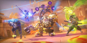
In Overwatch 2, the art works under extreme conditions:
- Fast camera displays are available for both players and observers.
- Multiple hero characters on-screen using shiny abilities simultaneously.
- Various lighting conditions across maps and day-night cycles.
These conditions offered a variety of solutions that Blizzard balances with the character design. The solutions are layered, either easily distinguishable across the silhouette stage or abstracted for how the character images work together:
- Silhouette Distinction: Tracer’s twin pulse pistols and chronal accelerator pods, Reinhardt’s hammer and massive shoulder plates, Sigma’s floating debris.
- Color Coding: recognizable color cues based on player roles (e.g., green for healing and red for danger), unique hero palettes that would stand out against any map.
- Animation Loops: Even idle animations would still convey function — Sojourn’s coiled runner’s stance would always convey speed, while Ana’s steady gait in a scoped position would convey precision.
The idea: players could even glance at the screen and know who is on the field, and the functions they could perform.
Backstage: The Character Design Process
Before any hero would receive any detail, the team would agree upon the hero’s role, narrative hook, and how they might functionally contribute to gameplay.
Is this hero a flanker diving into the backline? Is there a shield tank holding the front? Is there a hybrid support who can put pressure on the enemy team?
Then, they begin defining with shape language and utilize geometric shapes to communicate personality and role.
- Rounded shapes → welcoming, defensive, or supportive roles (Lúcio, Mei).
- Angular shapes → aggressive, dangerous (Reaper, Cassidy).
- Vertically exaggerated → dominant or commanding presence (Reinhardt, Sigma).
Only when the silhouette works in grayscale and reads clearly in motion can the artist hand the character to concept art, where the geographical and cultural influences, weaponry, and costume elements can be layered.
There are always iterations that are reviewed by the gameplay designers, animators, and art directors for feedback.
Tools and techniques to Bring Heroes to Life
Overwatch 2 character pipeline brings together 2D concept art with the 3D work made in production, as presented in the art style of the game:
- Photoshop for silhouette studies and colour responsivity studies.
- ZBrush for sculpting the detailed model.
- Maya for rig animation and animation breakdown.
- Substance Painter for textures and materials.
In-engine testing, where we could see how well our designs read from a distance, in lighting, and were functional in the context of gameplay.
Throughout the early stages of development, the Overwatch team used 3D blockouts, commonly referred to as low-detail models, to test in matches.
The idea was to find annotations and hitboxes that worked well in gameplay. This is essential for the later stages of character development, as you do not want to give birth to a beautiful design in your artwork only to discover it does not respond in the competitive portions of the game.
Making Digital Art Work for Competitive Gameplay
A hero can look awesome rendered as a 3D model, but in Overwatch 2, it takes more than just the hero looking awesome visually for their design to be successful. The art also needed to work for gameplay or:
- No visual clutter that hides the hero’s abilities in the chaos.
- Functional hitboxes – ensuring, to the best degree, the designs matched closely with collision in-game so that the character does not get notably unfair hits or misses.
- Skin-friendly – Each character had to be cautiously designed, as each character needed to accommodate a plethora of cosmetic variants while remaining true to the silhouette.
- Iteration in Action: Characters for Overwatch never ignite the process fully formed.
- Widowmaker’s armor had to be thinned from early scenarios to maintain a more sniper-like silhouette, as it is easier to appear like a sniper in flowing animations.
A few scenarios back again to Brigitte – for Brigitte’s gear, we needed to finely balance the gear to remain legible to the player seeing her both as a healer and as a close-range brawler.
There are usually internal playtests in which a piece of gear, such as having a too large shoulder pad, is too large to be legible; or, the combination of colours is too similar to the environment.
Those changes could be made dozens of times, if not more, before our concept is in a passable form for the internal release process.
Lessons for Aspiring Digital Artists
If you are an individual learning to make digital artwork through the constraints of video games, character development communicated through Overwatch 2 offers a comfortable frame of reference to consider. Some convenient takeaways:
- Silhouette first. The quickest way to recognition.
- Function first. A pretty piece of art that did not function in gameplay the way they were intended for collision, we would cut.
- Test in motion early. We could not rely on static concept art.
- Flexibility in design. Thinking about skins, upcoming updates, and balance.
- Iterate, iterate, iterate. Each pass is closer to clarity in gameplay.
Conclusion: Evolving while not losing identity
Since 2016, character design for Overwatch has always been a competitive edge. Overwatch 2 makes the case that digital art for games is not only they look visually impressive, but also functional in the high-paced metagame of competitive play.
By prioritizing the silhouette of characters while also being true to the character’s design, and iterating through testing in real match gameplay conditions, Blizzard’s art team elevates the playability of every hero to reach a state of full functionality in gameplay.
Creating Characters Players Will Remember
At MAGES Institute, we teach you more than just how to make digital artwork – we teach you to think like a professional character concept artist.
In our game development hands-on learning programs, you will complete real-world projects that mirror industry pipelines from initial silhouette sketches to in-engine testing, so you will have a portfolio that shows that you can create art that works just as well in terms of gameplay as it does for player experience.
Related Posts
SPEAK TO AN ADVISOR
Need guidance or course recommendations? Let us help!

